Python数据分析-数据可视化(转置+折线图plot+柱状图bar【单柱、多柱、堆积柱、双向柱】)
Matplotlib Pyplot
Pyplot 是 Matplotlib 的子库,提供了和 MATLAB 类似的绘图 API。
详细每种图表设置见 Matplotlib绘图设定
使用的时候,我们可以使用 import 导入 pyplot 库,并设置一个别名 plt:
import matplotlib.pyplot as plt
这样我们就可以使用 plt 来引用 Pyplot 包的方法。
以下是一些常用的 pyplot 函数:
plot():用于绘制线图和散点图
scatter():用于绘制散点图
bar():用于绘制垂直条形图和水平条形图
hist():用于绘制直方图
pie():用于绘制饼图
imshow():用于绘制图像
subplots():用于创建子图--plt.subplot(235)就是将绘图区域划分为2行3列,并在第5个位置创建子图
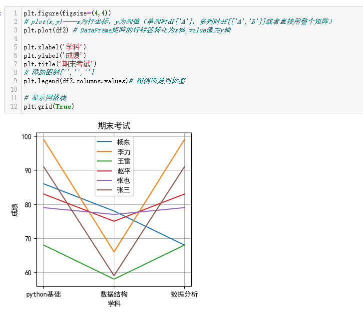
#添加标签和标题
plt.xlabel(‘Product’) 或axes.set_xlabel()
plt.ylabel(‘Total Sales’)或axes.set_ylabel()
plt.title(‘Stacked Sales by Product and Year - how2matplotlib.com’)绝大多数的 plt 函数都可以直接转换成 axes 方法(例如 plt.plot() → axes.plot()、 plt.legend() → axes.legend() 等)
plt.legend( )创建图例
- loc:图例位置,如 “best”(默认)、“upper right”、“lower left” 等。
- fontsize:字体大小,可为数值或 ‘small’、‘large’ 等关键字。
- title:图例标题,可配合 title_fontsize 调整大小。
ncol:列数,适合多系列数据时分列显示。
plt.xticks(位置,标签) 设置x轴刻度 例子:plt.xticks([0,1.5,3,4.5], df2.index)
plt.text()函数用于设置文字说明。在图表中添加文本
plt.text(
	x,
	y,
	string,
	fontsize=15,
	verticalalignment="top",
	horizontalalignment="right"
)
- x,y:表示坐标值上的值
- string:文字
- fontsize:表示字体大小
- va:垂直对齐方式 ,参数:[ ‘center’ | ‘top’ | ‘bottom’ | ‘baseline’ ]
- ha:水平对齐方式 ,参数:[ ‘center’ | ‘right’ | ‘left’ ]
举例:plt.text(x + 0.4, -y - 0.05, ‘%.2f’ % y, ha=‘center’, va=‘top’)
plt.subplot(235)就是将绘图区域划分为2行3列,并在第5个位置创建子图
以下是创建子图的例子
import matplotlib.pyplot as plt
plt.figure(figsize=(13,9))
plt.rcParams['font.family']='SimHei'
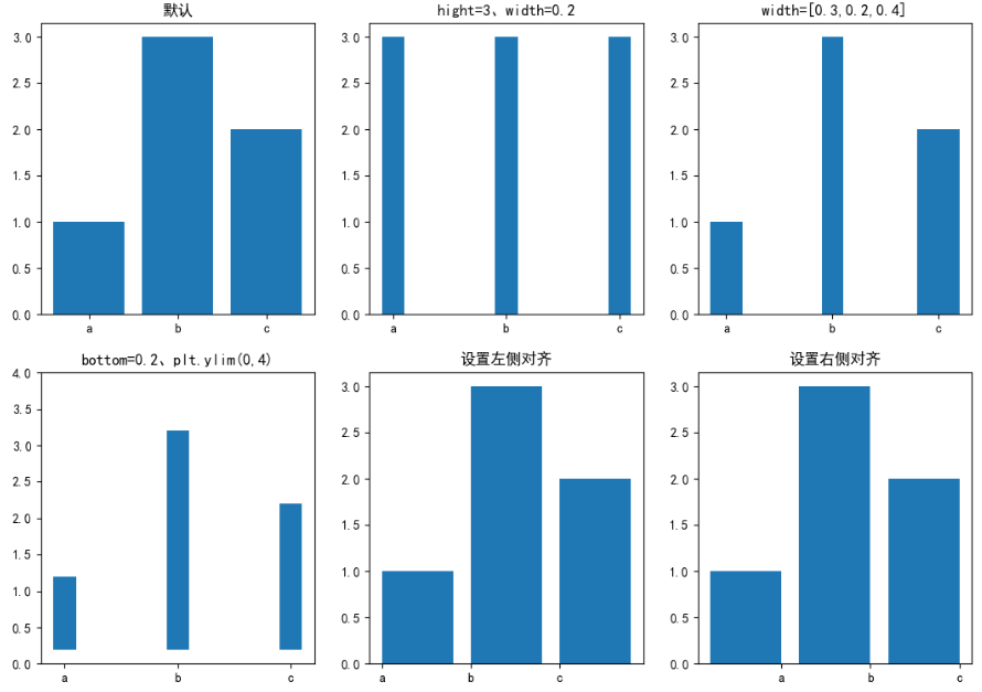
plt.subplot(231)#绘图区域划分为2行3列,并在第1个位置创建子图
x=['a','b','c']
hight=[1,3,2]
a=plt.bar(x,hight)
print(vars(a))
plt.title('默认')
plt.subplot(232)#绘图区域划分为2行3列,并在第2个位置创建子图
x=['a','b','c']
hight=3
width=0.2
plt.bar(x,hight,width)
plt.title('hight=3、width=0.2')
plt.subplot(233)
x=['a','b','c']
width=[0.3,0.2,0.4]
hight=[1,3,2]
a=plt.bar(x,hight,width)
plt.title('width=[0.3,0.2,0.4]')
plt.subplot(234)
x=['a','b','c']
hight=[1,3,2]
width=0.2
bottom=0.2
plt.ylim(0,4) # 设置y轴值显示范围
plt.bar(x,hight,width,bottom)
plt.title('bottom=0.2、plt.ylim(0,4)')
plt.subplot(235)#绘图区域划分为2行3列,并在第5个位置创建子图
x=['a','b','c']
hight=[1,3,2]
plt.bar(x,hight,align='edge')
plt.title('设置左侧对齐')
plt.subplot(236)
x=['a','b','c']
hight=[1,3,2]
width=-0.8
plt.bar(x,hight,width,align='edge')
plt.title('设置右侧对齐')
plt.show()
plot() 函数是绘制二维图形的最基本函数。
plt.plot(x, y, fmt, **kwargs)
x:表示X轴上的数据点,通常是一个列表、数组或一维序列,用于指定数据点的水平位置。
y:表示Y轴上的数据点,通常也是一个列表、数组或一维序列,用于指定数据点的垂直位置。
fmt:是一个可选的格式字符串,用于指定线条的样式、标记和颜色。例如,‘ro-’ 表示红色圆点线条。
**kwargs:是一系列可选参数,用于进一步自定义线条的属性,如线宽、标记大小、标签等。
以下是一些常用参数和用法:
-
样式参数(fmt): 格式字符串可以包含一个字符来指定颜色,一个字符来指定标记样式,以及一个字符来指定线条样式。例如,‘r-’
表示红色实线,‘bo–’ 表示蓝色圆点虚线。 -
线条样式(linestyle): 使用linestyle参数可以指定线条的样式,如实线(‘-’)、虚线(‘–’)、点划线(‘-.’)等。
-
标记样式(marker): 使用marker参数可以指定数据点的标记样式,如圆点(‘o’)、方块(‘s’)、星号(‘*’)等。
-
线条颜色(color):
使用color参数可以指定线条的颜色,可以使用颜色名称(如’red’)、缩写(如’r’)或十六进制颜色码(如’#FF5733’)。 -
线宽(linewidth): 使用linewidth参数可以指定线条的宽度,以数字表示。
-
其他属性: 还有许多其他属性可用于自定义线图,如透明度、渐变、线型、阴影等
bar柱状图
多种柱介绍可见 绘制单个、多个、堆积、双向柱形图
matplotlib.pyplot.bar(x, height, width=0.8, bottom=None, *, align='center', data=None, **kwargs)
bar()的返回值为BarContainer对象,其中patche属性为Rectangle列表,即一系列柱子。
bar()的基础参数如下:
- x:柱子在x轴上的坐标。浮点数或类数组结构。注意x可以为字符串数组!
- height:柱子的高度,即y轴上的坐标。浮点数或类数组结构。
- width:柱子的宽度。浮点数或类数组结构。默认值为0.8。
- bottom:柱子的基准高度。浮点数或类数组结构。默认值为0。
- align:柱子在x轴上的对齐方式。字符串,取值范围为{‘center’, ‘edge’},默认为’center’。
- ‘center’:x位于柱子的中心位置。
- ‘edge’:x位于柱子的左侧。如果想让x位于柱子右侧,需要同时设置负width 以及align=‘edge’。
柱子的位置由x以及align确定 ,柱子的尺寸由height和 width 确定。垂直基准位置由bottom确定(默认值为0)。大部分参数即可以是单独的浮点值也可以是值序列,单独值对所有柱子生效,值序列一一对应每个柱子。
import pandas as pd
import matplotlib.pyplot as plt
plt.rcParams['font.sans-serif']=['SimHei'] # 设置正常显示中文
plt.rcParams['axes.unicode_minus']=False # 设置正常显示负号
# 以上 整个文件中运行过一遍即可
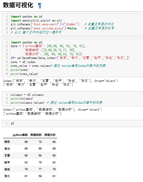
import pandas as pd
data = {'python基础': [86,99, 68, 83, 79, 91],
'数据结构':[78,66,58,75,77, 59],
'数据分析': [68, 99, 68,83, 79, 91]}
df= pd.DataFrame(data,index=['杨东','李力','王雷','赵平','张也','张三',])
rows = df.index
rows_value = rows.values# 通过.values拿到Index对象中的列表
print(rows)
print(rows_value)
columns = df.columns
print(columns)
print(columns.values) # 通过.values拿到Index对象中
df
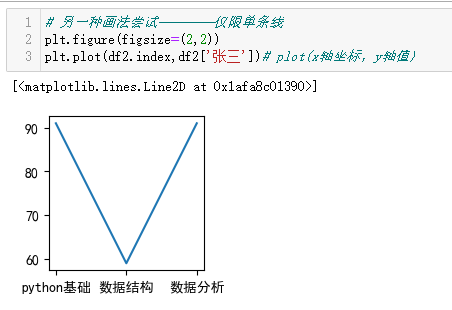
转置
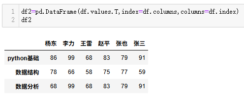
df2=pd.DataFrame(df.values.T,index=df.columns,columns=df.index)
df2
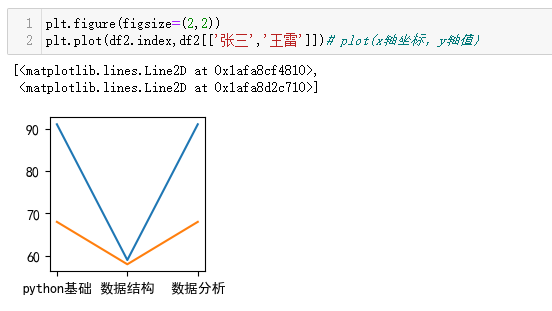
折线
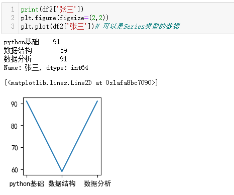
丰富样式
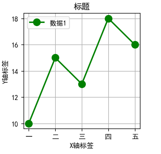
import matplotlib.pyplot as plt
#显示中文
plt.rcParams['font.sans-serif'] = ['SimHei']
# 示例数据

x = [1, 2, 3, 4, 5]
y = [10, 15, 13, 18, 16]
plt.figure(figsize=(3,3))

# 绘制线图,并自定义外观
plt.plot(
    x,                         # X轴数据
    y,                         # Y轴数据
    marker='o',                # 标记样式:圆点
    linestyle='-',             # 线条样式:实线
    color='green',              # 线条颜色:蓝色
    linewidth=2,               # 线宽:2
    markersize=10,              # 标记大小:8
    label='数据1'               # 图例标签
)

# 添加标签和标题
plt.xlabel('X轴标签')
plt.ylabel('Y轴标签')
plt.title('标题')

# 添加图例
plt.legend()

# 显示网格线
plt.grid(True)

# 自定义刻度
plt.xticks([1, 2, 3, 4, 5], ['一', '二', '三', '四', '五'])

# 显示图表
plt.show()
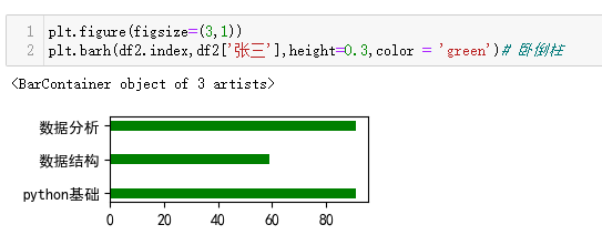
立柱
卧倒柱
plt.barh(x,y)
height与width含义互换
多个柱
同一x轴位置绘制多个柱状图,主要通过调整柱状图的宽度和每个柱状图x轴的起始位置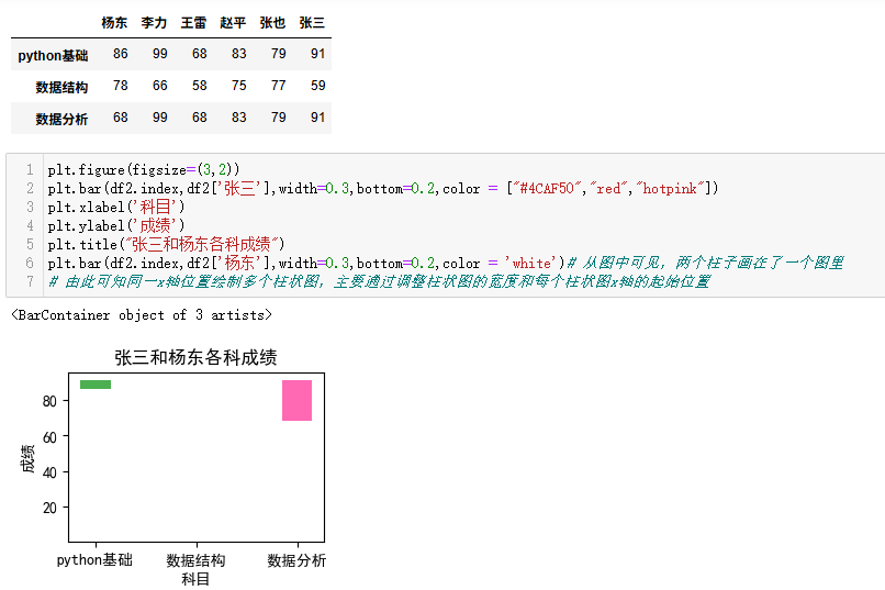
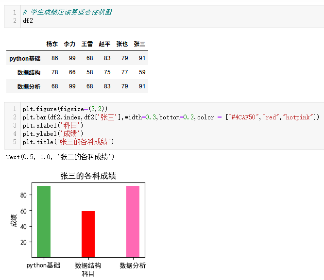
plt.figure(figsize=(3,2))
plt.bar(df2.index,df2['张三'],width=0.3,bottom=0.2,color = ["#4CAF50","red","hotpink"])
plt.xlabel('科目')
plt.ylabel('成绩')
plt.title("张三和杨东各科成绩")
plt.bar(df2.index,df2['杨东'],width=0.3,bottom=0.2,color = 'white')# 从图中可见,两个柱子画在了一个图里
# 由此可知同一x轴位置绘制多个柱状图,主要通过调整柱状图的宽度和每个柱状图x轴的起始位置
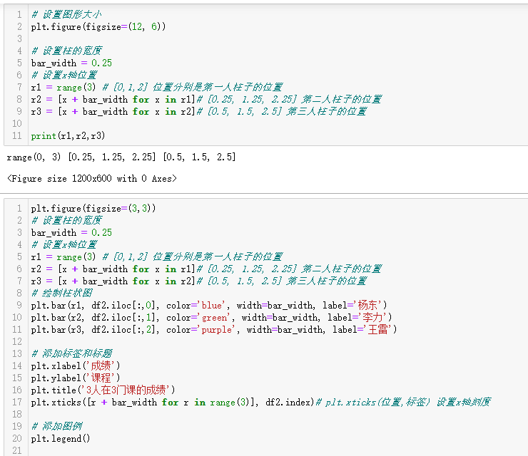
np.arange(3) 用这个得到的数组
# 设置图形大小
plt.figure(figsize=(12, 6))
# 设置柱的宽度
bar_width = 0.25
# 设置x轴位置
r1 = np.arange(3) # [0,1,2] 位置分别是第一人柱子的位置
r2 = [x + bar_width for x in r1]# [0.25, 1.25, 2.25] 第二人柱子的位置
r3 = [x + bar_width for x in r2]# [0.5, 1.5, 2.5] 第三人柱子的位置
print(r1,r2,r3)
plt.figure(figsize=(3,3))
# 设置柱的宽度
bar_width = 0.25
# 设置x轴位置
r1 = range(3) # [0,1,2] 位置分别是第一人柱子的位置
r2 = [x + bar_width for x in r1]# [0.25, 1.25, 2.25] 第二人柱子的位置
r3 = [x + bar_width for x in r2]# [0.5, 1.5, 2.5] 第三人柱子的位置
# 绘制柱状图
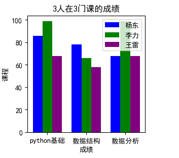
plt.bar(r1, df2.iloc[:,0], color='blue', width=bar_width, label='杨东')
plt.bar(r2, df2.iloc[:,1], color='green', width=bar_width, label='李力')
plt.bar(r3, df2.iloc[:,2], color='purple', width=bar_width, label='王雷')
# 添加标签和标题
plt.xlabel('成绩')
plt.ylabel('课程')
plt.title('3人在3门课的成绩')
plt.xticks([r + bar_width for r in range(3)], df2.index)# plt.xticks(位置,标签) 设置x轴刻度
# 添加图例
plt.legend()
设置柱子位置的另一种方式
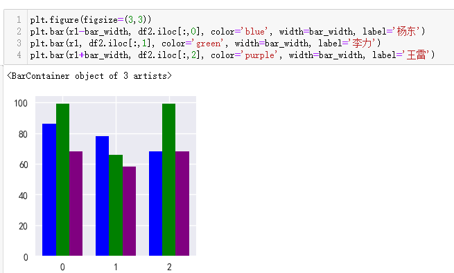
plt.figure(figsize=(3,3))
plt.bar(r1-bar_width, df2.iloc[:,0], color='blue', width=bar_width, label='杨东')
plt.bar(r1, df2.iloc[:,1], color='green', width=bar_width, label='李力')
plt.bar(r1+bar_width, df2.iloc[:,2], color='purple', width=bar_width, label='王雷')
绘制6人三科目
将df2表格里的任都绘制了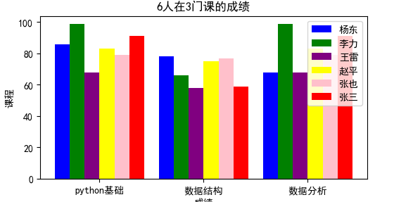
需要提前计算好,整个x轴的长度,每个柱所在位置
# 绘制6人三科目
# 一个柱子宽0.25,一个科目6*0.25,科目间隔0.25,所以总长6*0.25*3+0.25*2=5

# 设置图形大小
plt.figure(figsize=(6,3))
# 设置柱的宽度
bar_width = 0.25

# 设置x轴位置
r1 = [0,1.75,3.5] # [0,1,2] 位置分别是第一人柱子的位置
r2 = [x + bar_width for x in r1]# [0.25, 2.0, 3.75] 第二人柱子的位置
r3 = [x + bar_width for x in r2]# [0.5, 2.25, 4.0] 第三人柱子的位置
r4 = [x + bar_width for x in r3]#
r5 = [x + bar_width for x in r4]#
r6 = [x + bar_width for x in r5]#

# 绘制柱状图
plt.bar(r1, df2.iloc[:,0], color='blue', width=bar_width, label='杨东')
plt.bar(r2, df2.iloc[:,1], color='green', width=bar_width, label='李力')
plt.bar(r3, df2.iloc[:,2], color='purple', width=bar_width, label='王雷')
plt.bar(r4, df2.iloc[:,3], color='yellow', width=bar_width, label='赵平')
plt.bar(r5, df2.iloc[:,4], color='pink', width=bar_width, label='张也')
plt.bar(r6, df2.iloc[:,5], color='red', width=bar_width, label='张三')

# 添加标签和标题
plt.xlabel('成绩')
plt.ylabel('课程')
plt.title('6人在3门课的成绩')
plt.xticks([r + 2.5*bar_width for r in [0,1.75,3.5]], df2.index)# plt.xticks(位置,标签) 设置x轴刻度

# 添加图例
plt.legend()
样式优化
好看一点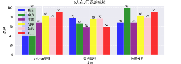
主要用到:
plt.style.use(‘seaborn-v0_8’)#提供了默认配色和线条风格,用于应用 Seaborn 风格的绘图样式(效果:背景色调)
plt.rcParams[‘font.sans-serif’]=[‘SimHei’] # 设置正常显示中文
plt.rcParams[‘axes.unicode_minus’]=False # 设置正常显示负号
添加数据标签*
def add_labels(bars):
for bar in bars:
height = bar.get_height()
plt.text(bar.get_x() + bar.get_width()/2., height,
f’{height}', ha=‘center’, va=‘bottom’)
add_labels(bars1)
add_labels(bars2)
add_labels(bars3)
add_labels(bars4)
add_labels(bars5)
add_labels(bars6)
添加图例:
plt.legend(loc=‘upper left’, frameon=True)# 图例位置在左上角,显示图例边框
添加网格线:
plt.grid(axis=‘y’, linestyle=‘–’, alpha=0.7)#axis=‘y’:只在y轴方向添加网格线# linestyle=‘–’:使用虚线样式# alpha=0.7:网格线透明度为0.7,避免过于抢眼
plt.tight_layout() tight_layout:自动调整子图参数,使图表元素不重叠
这对于防止标题、标签等元素被裁剪非常重要
# 绘制6人三科目
# 一个柱子宽0.25,一个科目6*0.25,科目间隔0.25,所以总长6*0.25*3+0.25*2=5

import pandas as pd
import matplotlib.pyplot as plt
# 它一定纲要用在中文设置前面,不然会将其覆盖导致显示不出中文
plt.style.use('seaborn-v0_8')#提供了默认配色和线条风格,用于应用 Seaborn 风格的绘图样式(效果:背景色调)


plt.rcParams['font.sans-serif']=['SimHei']   # 设置正常显示中文
plt.rcParams['axes.unicode_minus']=False     # 设置正常显示负号

# 设置图形大小
plt.figure(figsize=(7,3))


# 设置柱的宽度
bar_width = 0.25

# 设置x轴位置
r1 = [0,1.75,3.5] # [0,1,2] 位置分别是第一人柱子的位置
r2 = [x + bar_width for x in r1]# [0.25, 2.0, 3.75] 第二人柱子的位置
r3 = [x + bar_width for x in r2]# [0.5, 2.25, 4.0] 第三人柱子的位置
r4 = [x + bar_width for x in r3]#
r5 = [x + bar_width for x in r4]#
r6 = [x + bar_width for x in r5]#

# 绘制柱状图
# alpha=0.8:透明度为0.8(取值0-1),让柱子略微透明,避免过于厚重
# edgecolor='white':柱子边缘为白色,增加视觉层次感
bars1=plt.bar(r1, df2.iloc[:,0], color='blue', width=bar_width, label='杨东',alpha=0.8, edgecolor='white')
bars2=plt.bar(r2, df2.iloc[:,1], color='green', width=bar_width, label='李力',alpha=0.8, edgecolor='white')
bars3=plt.bar(r3, df2.iloc[:,2], color='purple', width=bar_width, label='王雷',alpha=0.8, edgecolor='white')
bars4=plt.bar(r4, df2.iloc[:,3], color='yellow', width=bar_width, label='赵平',alpha=0.8, edgecolor='white')
bars5=plt.bar(r5, df2.iloc[:,4], color='pink', width=bar_width, label='张也',alpha=0.8, edgecolor='white')
bars6=plt.bar(r6, df2.iloc[:,5], color='red', width=bar_width, label='张三',alpha=0.8, edgecolor='white')

# *********************************添加数据标签**********************************
def add_labels(bars):
    for bar in bars:
        height = bar.get_height()
        plt.text(bar.get_x() + bar.get_width()/2., height,
                 f'{height}', ha='center', va='bottom')

add_labels(bars1)
add_labels(bars2)
add_labels(bars3)
add_labels(bars4)
add_labels(bars5)
add_labels(bars6)


# 添加标签和标题
plt.xlabel('成绩')
plt.ylabel('课程')
plt.title('6人在3门课的成绩',fontweight='bold')

# plt.xticks(位置,标签) 设置x轴刻度
plt.xticks([r + 2.5*bar_width for r in [0,1.75,3.5]], df2.index)

# 添加图例
plt.legend(loc='upper left', frameon=True)# 图例位置在左上角,显示图例边框
# 添加网格线
plt.grid(axis='y', linestyle='--', alpha=0.7)#axis='y':只在y轴方向添加网格线\# linestyle='--':使用虚线样式\# alpha=0.7:网格线透明度为0.7,避免过于抢眼

# tight_layout:自动调整子图参数,使图表元素不重叠
# 这对于防止标题、标签等元素被裁剪非常重要
plt.tight_layout()
plt.show()
堆积柱
bottom参数来指定每一层的起始位置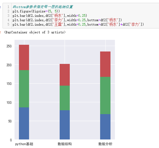
#bottom参数来指定每一层的起始位置
plt.figure(figsize=(5, 5))
plt.bar(df2.index,df2['杨东'],width=0.25)
plt.bar(df2.index,df2['李力'],width=0.25,bottom=df2['杨东'])
plt.bar(df2.index,df2['王雷'],width=0.25,bottom=df2['杨东']+df2['李力'])
上下双向柱
下方柱值乘(-1)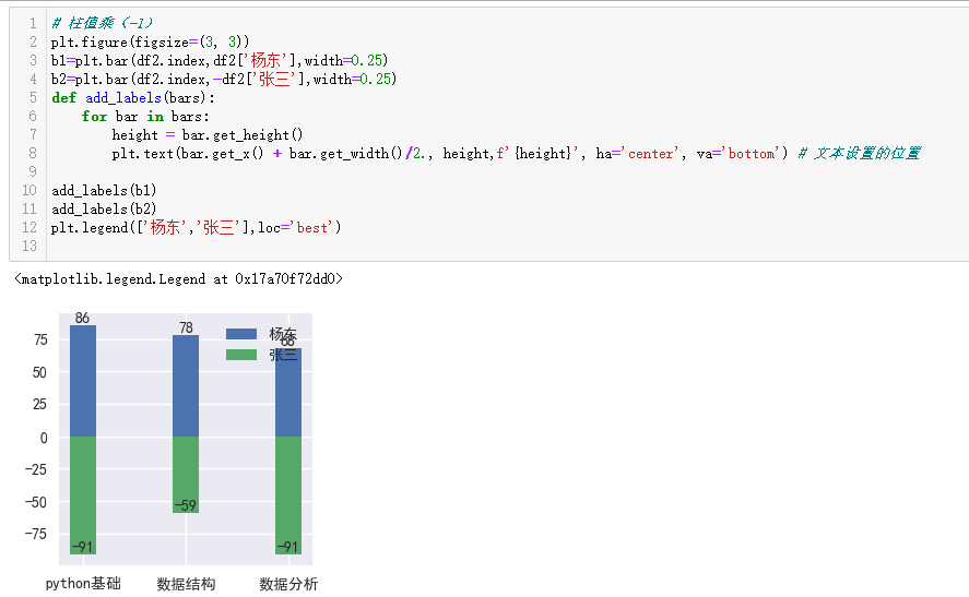
# 下方柱值乘(-1)
plt.figure(figsize=(3, 3))
b1=plt.bar(df2.index,df2['杨东'],width=0.25)
b2=plt.bar(df2.index,-df2['张三'],width=0.25)
def add_labels(bars):
    for bar in bars:
        height = bar.get_height()
        plt.text(bar.get_x() + bar.get_width()/2., height,f'{height}', ha='center', va='bottom') # 文本设置的位置

add_labels(b1)
add_labels(b2)
plt.legend(['杨东','张三'],loc='best')
左右双向柱
主要在于barh的使用,以及例外一个要乘(-1)
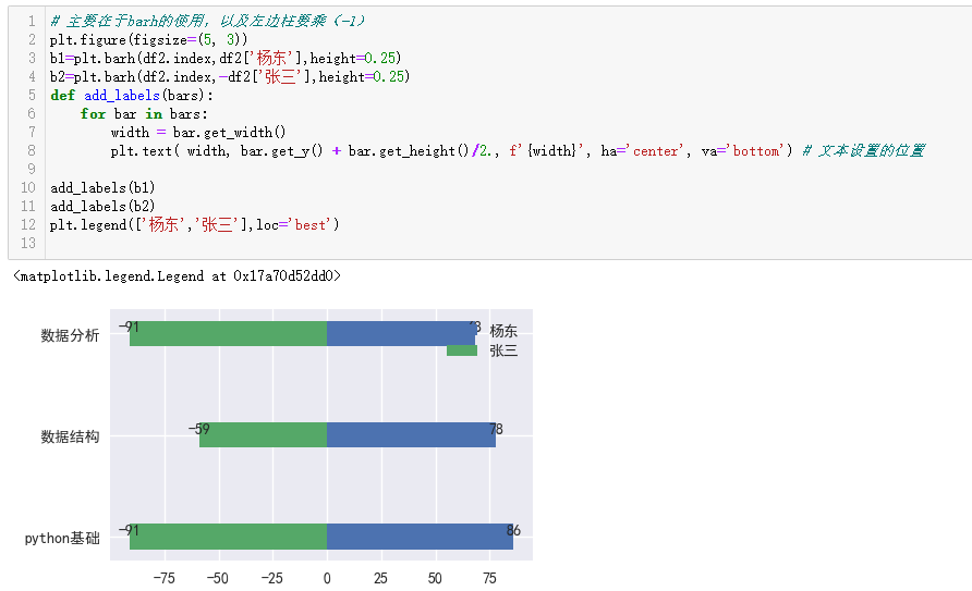
# 主要在于barh的使用,以及左边柱要乘(-1)
plt.figure(figsize=(5, 3))
b1=plt.barh(df2.index,df2['杨东'],height=0.25)
b2=plt.barh(df2.index,-df2['张三'],height=0.25)
def add_labels(bars):
    for bar in bars:
        width = bar.get_width()
        plt.text( width, bar.get_y() + bar.get_height()/2., f'{width}', ha='center', va='bottom') # 文本设置的位置

add_labels(b1)
add_labels(b2)
plt.legend(['杨东','张三'],loc='best')

助力广东及东莞地区开发者,代码托管、在线学习与竞赛、技术交流与分享、资源共享、职业发展,成为松山湖开发者首选的工作与学习平台
更多推荐


 17
17 0
0- 0


 已为社区贡献3条内容

所有评论(0)