Vue 项目主题切换功能实现:两种方案详解与选型分析
本文介绍了两种在Vue项目中实现主题切换的方法。第一种通过SCSS变量和CSS类名切换,在theme.scss中定义主题变量并在组件中切换类名。第二种更灵活,使用TypeScript定义主题配置,通过useTheme钩子动态修改CSS变量值,将主题信息存储在localStorage中。两种方法都能实现浅色/深色/自定义主题切换,但第二种方案提供了更强的类型安全和可扩展性,便于维护多主题配置。两种实
在现代前端项目开发中,主题切换已成为提升用户体验的核心功能之一 —— 无论是适配用户白天 / 夜间的使用场景、满足企业级产品的品牌定制需求,还是应对不同设备的显示环境,灵活的主题系统都能让产品更具竞争力。在 Vue 3 项目中,基于 CSS 变量与组合式 API(Composables)的主题切换方案最为常见,以下将详细拆解两种实现思路,并结合实际项目需求分析选型逻辑。
方案一:基于 CSS 类名切换的主题系统
该方案的核心思路是通过预定义不同主题的 CSS 类(如.theme-dark),在切换时为根元素添加 / 移除对应类名,触发全局 CSS 变量的替换,适合主题样式固定、扩展需求较少的中小型项目。
步骤 1:搭建全局样式文件结构
首先在/src/assets下新建styles文件夹并创建theme.scss文件 —— 选择 SCSS 而非普通 CSS,是因为 SCSS 支持变量嵌套、混入等特性,后续若需扩展主题样式(如添加主题专属组件样式),可更高效地维护。
theme.scss文件:
// 默认使用浅色主题
:root{
  --bg-color:#ffffff;
  --text-color: #333333;
}

// 深色主题
.theme-dark{
  --bg-color:#333333;
  --text-color: #ffffff;
}

// 自定义主题
.theme-custom{
  --bg-color: red;
  --text-color: #333333;
}

// 全局应用背景色
body{
  background-color: var(--bg-color);
  color: var(--text-color);
  transition: background-color 0.5s ease-in-out; // 添加过渡效果,平滑过渡
}
步骤 2:全局导入样式文件
在 Vue 入口文件main.ts中导入theme.scss—— 入口文件导入可确保样式全局生效,无需在每个组件中重复引入,避免代码冗余。同时,该步骤需在createApp之前执行,确保组件渲染时主题样式已加载。
import './assets/main.css'
import { createApp } from 'vue'
import { createPinia } from 'pinia'
import App from './App.vue'
import router from './router'
import './assets/styles/theme.scss'; // 导入全局主题样式:确保主题变量全局可访问

const app = createApp(App)

app.use(createPinia())
app.use(router)

app.mount('#app')
步骤 3:在头部组件实现主题切换交互
头部组件是用户高频操作区域,在此添加主题切换按钮可提升易用性。核心逻辑是通过useTheme组合式 API 封装主题切换方法,同时结合 Pinia 存储用户信息、定时器更新当前时间,确保功能模块化。
<script lang="ts" setup>
import router from '@/router';
import { ref, onMounted, watchEffect, computed, onUnmounted } from 'vue'
import type { Ref } from 'vue'
import { getUserInfo } from '@/api/home';
import { useUserStore } from '@/stores/user';
import { useTheme } from '@/composables/useTheme';
const { currentTheme, changeTheme } = useTheme();
const userStore = useUserStore()
interface IUserInfo {
adminid: string,
adminname: string,
checkedKeys: any[],
role: number
}
const userInfo: Ref<IUserInfo> = ref({
adminid: '',
adminname: '',
checkedKeys: [],
role: -1
})
// 1.使用 ref 创建一个响应式的当前时间 toLocaleString()是格式化日期和时间的方法
const currentTime = ref(new Date().toLocaleString())
// 2.定义一个函数来更新时间
function updateTime(){
currentTime.value = new Date().toLocaleString()
}
onMounted(async () => {
// 3.设置一个定时器,每一秒更新一遍时间
const time = setInterval(updateTime,1000)
onUnmounted(()=>{
// 4.在组件卸载时清除定时器,避免内存泄漏
clearInterval(time)
})
const res = await getUserInfo({
adminname: userStore.userInfo.adminname
})
userInfo.value = res.data.data[0]
})
const logout = (() => {
localStorage.removeItem('userInfo')
router.replace('/login')
})
</script>
<template>
<div class="header-manage">
<h1>HEADER</h1>
<div class="admin-manage">
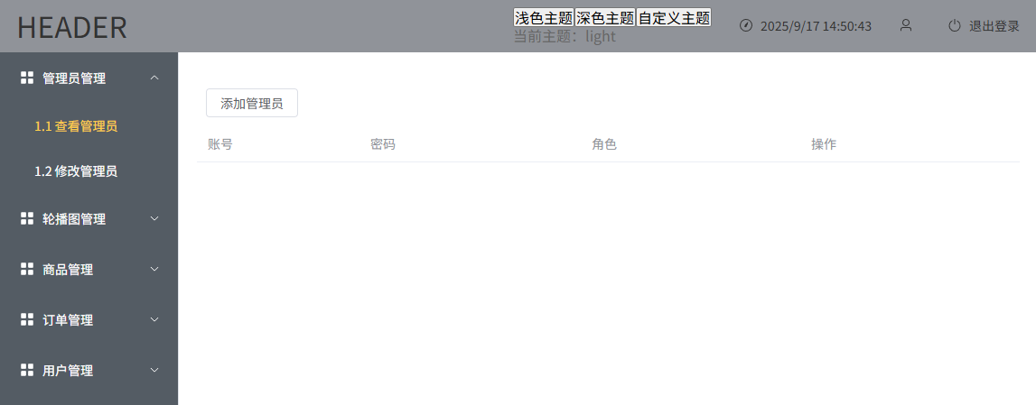
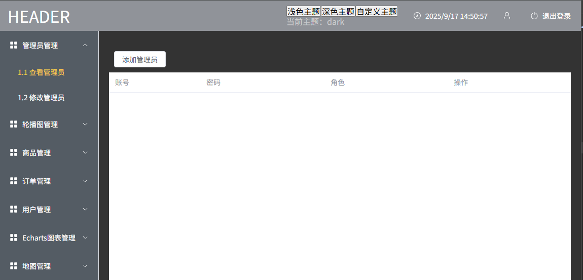
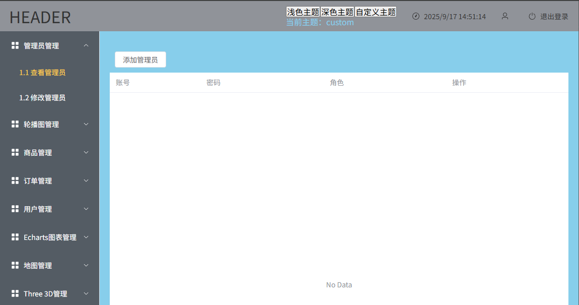
<div class="theme-switch">
<button @click="changeTheme('light')">浅色主题</button>
<button @click="changeTheme('dark')">深色主题</button>
<button @click="changeTheme('custom')">自定义主题</button>
<p class="theme-text">当前主题:{{ currentTheme }}</p>
</div>
<div class="admin-con">
<el-icon>
<i-ep-Stopwatch />
</el-icon>
<span>{{ currentTime }}</span>
</div>
<div class="admin-con">
<el-icon>
<i-ep-User />
</el-icon>
<span>{{ userStore.userInfo.adminname }}</span>
</div>
<div class="admin-con" style="cursor: pointer;">
<el-icon>
<i-ep-SwitchButton />
</el-icon>
<span @click="logout">退出登录</span>
</div>
</div>
</div>
</template>
<style lang="scss" scoped>
.header-manage {
width: 100%;
height: 100%;
display: flex;
justify-content: space-between;
align-items: center;
color:var(--text-primary-color) //全局主题颜色
}
.admin-manage {
display: flex;
.theme-switch {
.theme-text{
color: var(--text-secondary-color);
}
}
}
.admin-con {
margin-left: 30px;
display: flex;
align-items: center;
span {
font-size: 14px;
margin-left: 8px;
}
}
</style>方案二:基于 TypeScript 配置的动态主题系统
该方案的核心思路是通过 TypeScript 定义主题配置接口,将主题变量集中管理,切换时直接通过 JS 动态修改根元素的 CSS 变量,无需预定义 CSS 类,灵活性更高,适合主题变量多、需频繁扩展的中大型项目。
1. 步骤 1:搭建主题配置文件
在/src下新建theme文件夹并创建index.ts—— 用 TypeScript 定义主题接口与配置,既能通过类型约束避免变量名错误,又能将所有主题变量集中管理,后续修改或新增主题时,只需更新配置文件即可。
// 主题配置接口(添加索引签名)
interface ThemeConfig {
  "--bg-color": string;
  "--text-primary-color": string;
  "--text-secondary-color": string;
  "--text-tertiary-color": string;
  "--text-disabled-color": string;
  "--button-bg-color": string;
  "--button-text-color": string;
  // 索引签名:允许用字符串键访问(关键!)
  [key: string]: string;
}

// 主题类型定义
export type ThemeType = 'light' | 'dark' | 'custom'

// 主题配置
export const themeConfig: Record<ThemeType, ThemeConfig> = {
  light:{
    "--bg-color":'#ffffff', // 背景色
    "--text-primary-color": '#333333',// 主要文字色
    "--text-secondary-color":'#666666', // 次要文字色
    "--text-tertiary-color":'#999999', // 三级文字色
    "--text-disabled-color":'#cccccc', // 禁用文字色
    "--button-bg-color":'#42b983', // 按钮背景色
    "--button-text-color":'#ffffff', // 按钮文字色
  },
  dark:{
    "--bg-color":'#333333', // 背景色
    "--text-primary-color":'#ffffff', // 主要文字色
    "--text-secondary-color":'#cccccc', // 次要文字色
    "--text-tertiary-color":'#999999', // 三级文字色
    "--text-disabled-color":'#666666', // 禁用文字色
    "--button-bg-color":'#42b983', // 按钮背景色
    "--button-text-color":'#ffffff', // 按钮文字色
  },
  custom:{
     "--bg-color":'skyblue', // 背景色
    "--text-primary-color":'#333333', // 主要文字色
    "--text-secondary-color":'skyblue', // 次要文字色
    "--text-tertiary-color":'#999999', // 三级文字色
    "--text-disabled-color":'#cccccc', // 禁用文字色
    "--button-bg-color":'#42b983', // 按钮背景色
    "--button-text-color":'#ffffff', // 按钮文字色
  }
}

// 默认主题
export const defaultTheme: ThemeType = 'light';
步骤 2:封装主题切换组合式 API
在/src/composables下新建useTheme.ts—— 用 Vue 的组合式 API 封装主题切换逻辑,将 “主题初始化、主题应用、主题切换” 等功能模块化,后续任何组件需要使用主题功能,只需导入该 API 即可,避免代码重复。
import type { ThemeType } from '@/theme'
import { themeConfig, defaultTheme } from '@/theme'
import { onMounted, ref } from 'vue'

export function useTheme() {
  // 当前主题,响应式
  const currentTheme = ref<ThemeType>(defaultTheme)

  // 初始化:从localStorage中获取保存的主题
  onMounted(() => {
    const theme = localStorage.getItem('app-theme') as ThemeType
    if (theme && Object.keys(themeConfig).includes(theme)) {
      currentTheme.value = theme
      applyTheme(theme) //应用主题
    }
  })

  // 应用主题(核心:给html加主题类名,触发css变量切换)
  const applyTheme = (theme: ThemeType) => {
    // 先移除所有主题类
    document.documentElement.classList.remove('theme-light','theme-dark','theme-custom')
    // 添加当前主题类(如果不是默认主题)
    // if(theme !== 'light'){
    //   document.documentElement.classList.add(`theme-${theme}`)
    // }

    Object.keys(themeConfig[theme]).forEach(key => {
      document.documentElement.style.setProperty(`${key}`, themeConfig[theme][key]);
    });

    // document.documentElement.style.setProperty('--bg-color', themeConfig[theme].backgroundColor);

    // 存储当前主题
    localStorage.setItem('app-theme', theme)
  }

  // 切换主题
  const changeTheme = (theme: ThemeType) => {
    if(themeConfig[theme]){
      currentTheme.value = theme
      applyTheme(theme)
    }
  }

  return { currentTheme, changeTheme }
}
步骤 3:复用组件交互逻辑
与方案一的步骤 3 一致,在头部组件中导入useTheme API,绑定按钮点击事件触发changeTheme—— 由于方案二的主题逻辑已通过 API 封装,组件层面无需修改任何交互代码,只需复用现有按钮即可实现主题切换,体现了模块化的优势。
三、两种方案对比与选型分析
| 对比维度 | 方案一(CSS 类名切换) | 方案二(TS 配置动态修改) |
|---|---|---|
| 实现原理 | 预定义主题类,通过添加 / 移除类名切换 | 集中管理 TS 配置,动态修改 CSS 变量 |
| 灵活性 | 新增主题需修改 CSS 文件,扩展成本高 | 新增主题只需添加 TS 配置,扩展成本低 |
| TypeScript 支持 | 无类型约束,易出现变量名错误 | 接口 + 类型约束,避免变量错误 |
| 维护成本 | 主题样式分散在 CSS 中,维护难度高 | 主题配置集中在 TS 中,维护更高效 |
| 持久化实现 | 需额外编写逻辑保存类名 | 内置 localStorage 保存,逻辑更简洁 |
| 适用场景 | 主题少、需求稳定的中小型项目 | 主题多、需频繁扩展的中大型项目 |
从实际项目需求出发,方案二的优势更为明显:一是 TypeScript 的类型约束降低了协作中的错误率;二是集中式配置让主题维护更高效(如后续新增 “企业主题”,只需在themeConfig中添加配置);三是动态修改 CSS 变量无需预定义类名,减少了 CSS 代码冗余。因此,最终选择方案二作为项目的主题切换实现方案。

助力广东及东莞地区开发者,代码托管、在线学习与竞赛、技术交流与分享、资源共享、职业发展,成为松山湖开发者首选的工作与学习平台
更多推荐


 4
4 0
0- 0


 已为社区贡献1条内容

所有评论(0)