将Tailwind CSS,融入Vue+ElementPlus方案,制作专业级AI应用首页
本文介绍了在Vue项目中安装配置TailwindCSS的完整流程,并展示了如何利用其原子类构建现代化UI界面。主要内容包括:1)通过npm安装TailwindCSS及相关依赖;2)配置tailwind.config.js和postcss.config.js文件;3)创建基础样式文件;4)详细解析了页面代码中的TailwindCSS应用,包括布局定位、视觉样式、交互效果等核心功能类;5)特别说明了响
目录
🧭 定位与层级 (Positioning & Stacking)
声明:
本篇文章所需的前置知识:VUE、ElementPlus
一.安装和配置TailwindCSS
1.安装依赖
在vue项目的控制台,依次输入以下两个命令
npm install -D tailwindcss postcss autoprefixernpx tailwindcss init -p
解读:
①第一行:
npm install -D tailwindcss postcss autoprefixer这条命令使用 npm 安装三个开发依赖包:
-D或--save-dev:表示将这些包安装为开发依赖(devDependencies),只在开发时使用,生产构建时不需要(生产时,你写的 Tailwind 样式会完全保留,只是它的"工具包"不需要在服务器上继续工作了。)
tailwindcss:Tailwind CSS 框架本身,提供所有的工具类(utilities)
postcss:一个处理 CSS 的工具(CSS 处理器),Tailwind 需要它来转换 CSS
autoprefixer:自动添加 CSS 浏览器前缀的 PostCSS 插件(如-webkit-、-moz-),确保样式在不同浏览器中都能正常工作
②第二行:
npx tailwindcss init -p这条命令初始化 Tailwind CSS 的配置文件:
npx:执行项目中安装的包,而不是全局安装的
tailwindcss init:创建 Tailwind CSS 的配置文件tailwind.config.js
-p或--postcss:同时创建一个 PostCSS 配置文件postcss.config.js执行后生成的两个文件:
文件1:tailwind.config.js- Tailwind 的主配置文件/** @type {import('tailwindcss').Config} */ // 这行是类型注释,帮助编辑器提供自动补全 module.exports = { content: [], // 重要!需要配置要扫描的文件路径,例如:['./src/**/*.{html,js}'] theme: { extend: {}, // 在这里扩展自定义主题配置(颜色、字体、间距等) }, plugins: [], // 在这里添加 Tailwind 插件 }文件2:
postcss.config.js- PostCSS 配置文件
module.exports = {
  plugins: {
    tailwindcss: {},  // 使用 Tailwind CSS 插件,处理 @tailwind 指令
    autoprefixer: {}, // 使用 Autoprefixer 插件,自动添加浏览器前缀
  },
}
2.配置tailwind.config.js文件
/** @type {import('tailwindcss').Config} */
module.exports = {
  // 重要:告诉 Tailwind 扫描哪些文件
  content: [
    "./public/index.html",
    "./src/**/*.{vue,js,ts,jsx,tsx}",
  ],
  theme: {
    extend: {

    },
  },
  plugins: [],
}
3.配置postcss.config.js文件
module.exports = {
  plugins: {
    tailwindcss: {},
    autoprefixer: {},
  },
}
4.创建并配置src/assets/style.css文件
@tailwind base;
@tailwind components;
@tailwind utilities;

body {
    margin: 0;
    /* background-color: #000; */
}
二.页面代码实现
<template>
  <div class="relative h-screen w-full overflow-hidden bg-black">
    <!-- 视频背景层 -->
    <video
      autoplay
      muted
      loop
      playsinline
      class="absolute inset-0 w-full h-full object-cover z-0"
    >
      <!-- 替换为你的视频路径 -->
      <source src="../assets/robot_romantic.mp4" type="video/mp4" />
      您的浏览器不支持 video 标签。
    </video>
    <!-- 可选:半透明遮罩,增强文字可读性(可根据需要调整透明度) -->
    <div class="absolute inset-0 bg-black/40 z-5"></div>

    <!-- logo -->
    <img
    src="../assets/W.png"
    class="absolute top-2 left-2 w-20 h-24 z-2"
    alt="LOGO">

    <!-- 主视觉区域 -->
    <div class="relative mt-10 flex h-full items-center justify-center">
      <!-- AI头像与光效 -->
      <div class="relative w-full max-w-4xl text-center px-4">
        <!-- 模拟AI头像、光环动画 -->
        <!-- <div class="relative w-32 h-32 mx-auto">
          <img
            src="../assets/casually.jpg"
            alt="AI Avatar"
            class="w-full h-full rounded-full object-cover opacity-80 hover:opacity-100 transition-opacity duration-300"
          />
          <div class="absolute inset-0 rounded-full border-4 border-gray-500/30 animate-pulse"></div>
        </div> -->

        <!-- 标题 -->
        <h1 class="mt-10 text-4xl md:text-4xl font-normal text-white">
          有什么新的故事灵感?
        </h1>

        <!-- 输入框 -->
        <div class="mt-6 max-w-md mx-auto relative">
          <input
            v-model="prompt"
            @keyup.enter="generate"
            placeholder="输入你的灵感,AI 会为你自动策划内容生成视频"
            class="w-full px-6 py-3 pr-12 rounded-full bg-white/10 backdrop-blur-lg text-white border border-white/20 focus:border-white/50 focus:ring-2 focus:ring-white/30 focus:outline-none transition-all duration-300 placeholder:text-white/50"
          />
          <!-- <div class="absolute inset-y-0 right-2 flex items-center pr-3 pointer-events-none">
            <el-icon><Top /></el-icon>
          </div> -->
          <!-- 修改部分:给 div 加上圆形和背景样式 -->
          <div class="absolute inset-y-0 right-2 top-2 flex items-center justify-center w-8 h-8 rounded-full bg-white/20 pointer-events-none">
            <el-icon class="text-white">
              <Top />
            </el-icon>
          </div>
        </div>

        <!-- 按钮 -->
        <!-- <button
          @click="generate"
          class="mt-4 px-8 py-3 rounded-full bg-pink-600 text-white font-medium hover:bg-pink-500 transition-colors duration-300 shadow-lg hover:shadow-pink-500/30"
        >
          生成视频
        </button> -->
      </div>
    </div>

    <!-- 侧边栏(左侧) -->
    <div class="absolute top-64 left-0 p-4">
      <!-- 父容器:负责整体的胶囊背景和圆角 -->
      <div class="flex flex-col items-center bg-white/10 backdrop-blur-lg rounded-full px-2 py-1 space-y-1">

        <!-- 按钮列表 -->
        <button
          v-for="(icon, index) in sidebarIcons"
          :key="index"
          class="w-full p-2 rounded-lg text-white hover:bg-white/20 transition-colors rounded-full"
          :title="icon.title"

        >
          <component :is="icon.component" class="w-6 h-6"  />
        </button>

      </div>
    </div>

    <!-- 底部功能区 -->
    <div class="absolute bottom-0 left-0 p-4 flex justify-between w-full ">
      <!-- <div class="flex space-x-4">
        <button class="text-white hover:text-pink-400 transition-colors">灵感广场</button>
        <button class="text-white hover:text-pink-400 transition-colors">我的作品</button>
      </div> -->
      <div class="flex space-x-4">
        <button class="text-gray-400 hover:text-white transition-colors">灵感广场</button>
        <button class="text-gray-400 hover:text-white transition-colors">我的作品</button>
      </div>
      <button
        class="flex items-center space-x-2 px-4 py-2 rounded-full
              bg-white bg-opacity-10 backdrop-blur-md
              border border-white border-opacity-20
              hover:bg-opacity-20
              transition-all duration-300 ease-in-out
              shadow-lg"
        @click="publish"
      >
        <!-- 使用 Heroicons 的 PlusIcon -->
        <PlusIcon class="w-5 h-5 text-white" />
        <span class="text-white text-sm font-medium">发布作品</span>
      </button>
    </div>

    <!-- 提示信息 -->
    <div class="absolute top-8 right-4 text-white text-sm space-x-2">
      <span class="px-6 py-2 rounded-lg bg-white/10 text-white hover:bg-white/20 transition-colors">
        <!-- 使用图标代替加号 -->
        <CurrencyDollarIcon class="absolute mx-4 w-5 h-5 text-white" />
        <span class="ml-3">72</span>
      </span>
      <span class="py-2 px-3 rounded-lg bg-white/10 text-white hover:bg-white/20 transition-colors">开通会员</span>
    </div>
  </div>
</template>

<script setup>
import { ref } from 'vue';
import { HomeIcon, FolderIcon, UserIcon, BellIcon, PlusIcon, CurrencyDollarIcon } from '@heroicons/vue/24/outline';
/* 导入element-plus图标 */
import { Top } from '@element-plus/icons-vue'
//导入“关于作者”页面所需样式
import '@/assets/style.css';
const prompt = ref('');

const sidebarIcons = [
  { component: HomeIcon, title: '首页' },
  { component: FolderIcon, title: '项目' },
  { component: UserIcon, title: '个人中心' },
  { component: BellIcon, title: '通知' },
];

const generate = () => {
  if (prompt.value.trim()) {
    alert(`AI 正在为你生成:${prompt.value}`);
    // 这里可以调用你的 AI 生成接口
  }
};

const publish = () => {
  alert('发布功能暂未开放');
};
</script>

<style scoped>
/* 自定义动画 */
@keyframes pulse {
  0% {
    transform: scale(1);
    opacity: 1;
  }
  50% {
    transform: scale(1.05);
    opacity: 0.8;
  }
  100% {
    transform: scale(1);
    opacity: 1;
  }
}

.animate-pulse {
  animation: pulse 3s infinite ease-in-out;
}
</style>
注意:此时是在script标签中,引入的上面那个css文件
//导入页面所需的tailwind css样式
import '@/assets/style.css';
vue的rooter路由(页面跳转)我们已经配置好了,由于此处和Tailwind CSS关系不大,所以我们就不详细讲解了。
三.代码中的Tailwind CSS相关知识解读
这段代码是一个典型的 Vue 3 单文件组件(SFC),它大量使用了 Tailwind CSS 来实现现代化的样式设计。Tailwind CSS 是一种“实用优先”(Utility-First)的 CSS 框架,它不提供预设的组件(如 Bootstrap),而是提供大量的原子类(Atomic Classes),让你通过组合这些类来构建自定义设计。
结合代码和 Tailwind CSS 的特性,我为你整理了以下核心知识点:
🎨 布局与定位
- 尺寸与盒模型:
h-screen,w-full: 使用视口单位,分别代表 100vh 高度和 100vw 宽度。max-w-4xl: 设置最大宽度,用于限制内容宽度,防止在大屏幕上过宽。inset-0: 在绝对定位元素中,等同于top: 0; left: 0; bottom: 0; right: 0;,常用于覆盖全屏或作为遮罩。- Flex 布局:
flex,items-center,justify-center: 构建了经典的 Flex 居中布局。items-center控制交叉轴(垂直)居中,justify-center控制主轴(水平)居中。flex-col,space-y-1,space-x-4:flex-col将主轴变为垂直方向;space-y-1和space-x-4是 Tailwind 的间距神器,用于在子元素之间创建垂直或水平间距,无需给子元素单独写 margin。- 定位系统:
relative,absolute: 用于层叠布局。代码中视频背景、遮罩层、Logo、侧边栏和底部栏都使用了绝对定位,脱离文档流,实现叠加效果。
🎨 视觉样式与美化
- 背景与透明度:
bg-black,bg-white/10: 设置背景颜色。/10是 Tailwind CSS 3.0+ 的新语法,直接设置颜色的透明度(10% 不透明度)。backdrop-blur-lg: 实现毛玻璃(背景模糊)效果,常用于导航栏或卡片悬浮层。- 边框与圆角:
rounded-full: 将元素变成圆形(完全圆角)。border,border-white/20: 设置边框样式和颜色。- 阴影:
shadow-lg,shadow-pink-500/30: 添加阴影效果,提升元素的立体感。
✨ 交互与动效
- 变换与过渡:
hover:opacity-100,hover:bg-white/20: 定义鼠标悬停时的状态。Tailwind 支持多种状态变体(如hover:、focus:、lg:)。transition-all duration-300 ease-in-out: 实现平滑的过渡动画,让颜色、大小变化不那么生硬。- 自定义动画:
animate-pulse: 代码中虽然引入了自定义的@keyframes pulse,但在 Tailwind 中,animate-pulse通常是默认提供的,用于模拟加载时的呼吸灯效果(缩放和透明度变化)。
📱 响应式设计
- 断点前缀:
md:text-4xl,lg:flex: Tailwind 使用移动优先的策略。md:表示在中等屏幕及以上生效,lg:表示在大屏幕及以上生效。例如,侧边栏按钮在小屏幕上可能是一列,在大屏幕上会变成横排。
💡 代码中几个特别的 Tailwind 写法
- 任意值(Arbitrary Values):
- 代码中使用了类似
w-[200px]或bg-[#e6e6e6]的写法(虽然在提供的代码片段中未直接出现,但属于常见用法),或者像top-64(16rem)这样的固定值。Tailwind 支持在类名中直接写入自定义值,非常灵活。- 层叠与优先级:
z-0,z-5,z-10: 控制元素的堆叠顺序(z-index)。-m-1.5,-mt-4: 负值间距,用于微调位置或抵消默认间距。
📏 布局与盒模型 (Layout & Box Model)
类名 含义解析 作用说明 h-screenheight: 100vh 设置元素高度为视口的 100% w-fullwidth: 100% 设置元素宽度为父容器的 100% max-w-md/max-w-4xlmax-width 设置最大宽度。 md约为 28rem,4xl约为 80rem。防止元素在大屏幕上过宽。mx-automargin-left & margin-right: auto 实现水平居中 mt-6/mt-10/mt-4margin-top 设置上边距。 6= 1.5rem (24px),10= 2.5rem (40px)mb-4margin-bottom 设置下边距 (代码中注释部分有提及) p-4/px-2/py-1padding p-4是四周内边距;px-2是左右内边距;py-1是上下内边距。space-y-1/space-x-4gap 设置子元素之间的间距。 space-y-1是垂直间距,space-x-4是水平间距。overflow-hiddenoverflow: hidden 隐藏溢出的内容(常用于裁剪视频或图片) inset-0top, right, bottom, left: 0 绝对定位时,让元素填充父容器(等同于 top:0; left:0; ...)
🧭 定位与层级 (Positioning & Stacking)
类名 含义解析 作用说明 relativeposition: relative 相对定位,通常作为绝对定位子元素的参考容器 absoluteposition: absolute 绝对定位,脱离文档流,相对于最近的定位祖先元素 z-0/z-5/z-10z-index 控制元素的堆叠顺序(层级)。数字越大,层级越高 🎨 颜色与背景 (Colors & Background)
类名 含义解析 作用说明 bg-blackbackground-color: black 设置背景色为黑色 bg-white/10background-color: rgba(255,255,255,0.1) 设置背景色为白色, /10表示 10% 的透明度text-whitecolor: white 设置文字颜色为白色 text-gray-400color: theme('colors.gray.400') 设置文字颜色为灰色调色板中的 400 号色 borderborder-width: 1px 添加边框 border-white/20border-color: rgba(255,255,255,0.2) 设置边框颜色为白色,20% 透明度
🎨 视觉效果 (Visual Effects)
类名 含义解析 作用说明 rounded-fullborder-radius: 9999px 设置完全圆角,通常用于圆形或胶囊形状 rounded-lgborder-radius: 0.5rem 设置较大的圆角 shadow-lgbox-shadow: large 添加较大的阴影 shadow-pink-500/30box-shadow: color + opacity 设置阴影颜色为粉红色 500 号色,30% 透明度 backdrop-blur-lgbackdrop-filter: blur() 背景模糊效果(毛玻璃),常用于导航栏或模态框
🤖 Flex 布局 (Flexbox)
类名 含义解析 作用说明 flexdisplay: flex 开启弹性布局 flex-colflex-direction: column 设置主轴方向为垂直 items-centeralign-items: center 交叉轴居中对齐 justify-centerjustify-content: center 主轴居中对齐 justify-betweenjustify-content: space-between 两端对齐,项目之间间隔相等
🖱️ 交互与状态 (Interaction)
类名 含义解析 作用说明 hover:bg-white/20&:hover { background-color: ... } 鼠标悬停时的背景色 hover:text-white&:hover { color: ... } 鼠标悬停时的文字颜色 focus:border-white/50&:focus { border-color: ... } 元素获得焦点(如输入框被点击)时的边框色 focus:ring-2&:focus { ring-width: 2px } 聚焦时的光晕宽度 focus:outline-none&:focus { outline: none } 移除默认的聚焦轮廓线 transition-alltransition: all 开启所有属性的过渡动画 duration-300transition-duration: 300ms 动画持续时间为 300 毫秒 ease-in-outtransition-timing-function 动画速度曲线(先慢后快再慢)
📱 响应式设计 (Responsive)
类名 含义解析 作用说明 md:text-4xl@media (min-width: 768px) { ... } 在中等屏幕(768px)及以上,文字大小为 4xl
🖼️ 其他实用类
类名 含义解析 作用说明 object-coverobject-fit: cover 图片或视频填充容器并保持比例,裁剪溢出部分(常用于背景视频) font-normalfont-weight: 400 字体粗细为正常 text-4xlfont-size: 2.25rem 设置文字大小 text-centertext-align: center 文字居中对齐 w-20/h-24/w-6/h-6width / height 设置具体的宽高。 20= 5rem (80px),24= 6rem (96px),6= 1.5rem (24px)pointer-events-nonepointer-events: none 元素不响应鼠标事件(常用于图标,让点击穿透到父元素) opacity-80opacity: 0.8 设置元素透明度为 80% 总结来说,这段代码利用 Tailwind 的原子类,将样式逻辑直接内聚在 HTML 结构中,使得开发时无需频繁切换文件写 CSS,且样式意图一目了然。
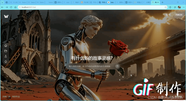
四.效果展示
以上就是本篇文章的全部内容,喜欢的话可以留个免费的关注呦~~~

助力广东及东莞地区开发者,代码托管、在线学习与竞赛、技术交流与分享、资源共享、职业发展,成为松山湖开发者首选的工作与学习平台
更多推荐


 16
16 0
0- 0


 已为社区贡献3条内容

所有评论(0)