08_Matplotlib数据可视化
·
文章目录
1 绘图流程
- 创建画布
plt.figure() - 绘制图像
plt.plot(x, y)等 - 显示图像
plt.show()
import matplotlib.pyplot as plt
plt.figure(figsize=(10, 8))
plt.plot([1, 2, 3, 4], [10, 20, 15, 30])
plt.show()
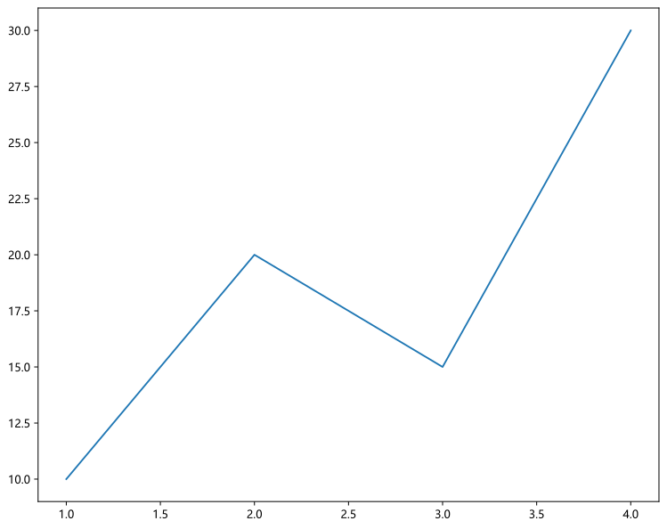
使用以下魔法方法可以在画图的时候生成矢量图,图片更清晰。
%config InlineBackend.figure_format='svg'
2 常用图形
2.1 折线图
绘制连续数据的折线图,适用于显示随时间或序列变化的趋势。
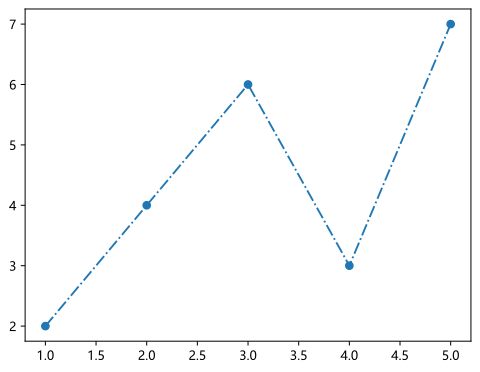
plt.plot(x, y, linestyle='-', marker='o', color='b', label='')
x/y:横纵坐标数据linestyle:线的样式'-''--''-.'':'
marker:标记点的样式'o''s''^'
color:线的颜色label:图例标签(配合plt.legend()使用)
x = [1, 2, 3, 4, 5]
y = [2, 4, 6, 3, 7]

plt.plot(x, y, linestyle='-.', marker='o')
plt.show()
2.2 柱形图
绘制垂直的柱状图,用于比较不同类别的数量或数值大小。
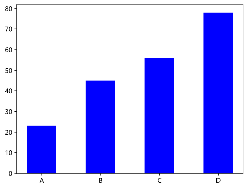
plt.bar(x, height, width=0.8, color='b', label='')
x:柱子横坐标height:柱子的高度width:柱子宽度(0~1)color:柱子颜色label:图例标签(配合plt.legend()使用)
x = ['A', 'B', 'C', 'D']
height = [23, 45, 56, 78]

plt.bar(x, height, color='b', width=0.5)
plt.show()
2.3 条形图
绘制横向的柱状图,在类别名称较长时更清晰。
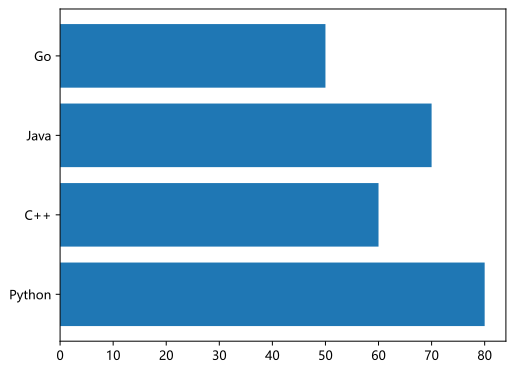
plt.barh(y, width, color='b', label='')
y: 柱子的纵坐标width: 柱子的长度color:柱子颜色label:图例标签(配合plt.legend()使用)
y = ['Python', 'C++', 'Java', 'Go']
width = [80, 60, 70, 50]

plt.barh(y, width)
plt.show()
2.4 直方图
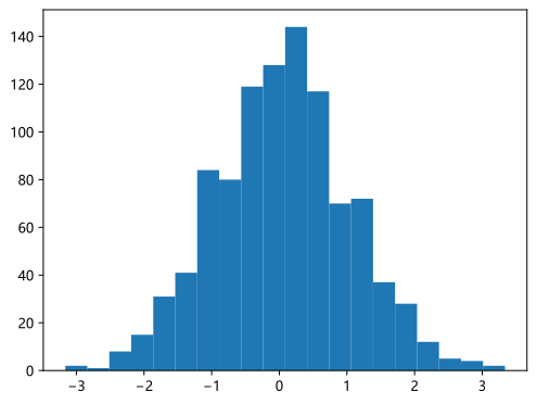
用于展示数据的分布情况,将数据分成若干个区间 (bin),并统计每个区间内的数据数量。
plt.hist(data, bins=10, color='purple')
data:一维数据集bins:分组数量color:柱子颜色label:图例标签(配合plt.legend()使用)
import numpy as np

data = np.random.randn(1000)

plt.hist(data, bins=20)
plt.show()
2.5 饼图
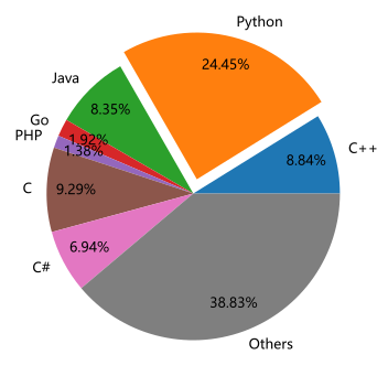
用于展示不同类别在总体中所占的比例。
plt.pie(sizes, labels=labels, autopct='%1.1f%%', explode='')
sizes:各部分的数值labels:各部分的名称autopct:显示百分比的格式字符串explode:突出显示指定扇形,控制凸起程度pctdistance:百分比离圆心的距离,单位为半径labeldistance:标签离圆心的距离,单位为半径
lan = ['C++', 'Python', 'Java', 'Go', 'PHP', 'C', 'C#', 'Others']
rate = [8.84, 24.45, 8.35, 1.92, 1.38, 9.29, 6.94, 38.83]
ex = [0, 0.1, 0, 0, 0, 0, 0, 0]

plt.pie(rate, labels=lan, explode=ex, autopct='%.2f%%', pctdistance=0.8)
plt.show()
2.6 散点图
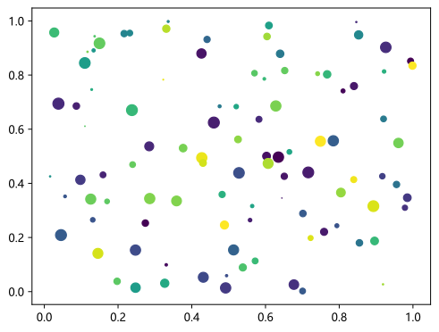
用于展示两个变量之间的关系,每个数据点在图上表示为一个点。
plt.scatter(x, y, color='red', s=50, alpha=0.6, label='')
x/y:横纵坐标color:点的颜色(只能指定一个)c:可以使用颜色列表s:点的大小alpha:点的透明度label:图例cmap: 颜色映射,将数值映射到颜色
sx = np.random.rand(100)
sy = np.random.rand(100)
colors = np.random.rand(100)
sizes = 100 * np.random.rand(100)

plt.scatter(sx, sy, c=colors, s=sizes, cmap='viridis')
plt.show()
2.7 箱线图
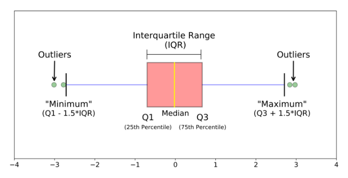
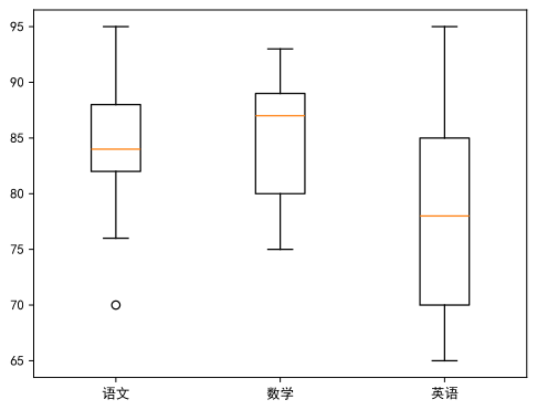
箱线图又叫箱型图或盒须图,是一种用于展示一组数据分散情况的统计图表。
-
箱子中间线:中位数(Median)
-
箱子上边界:上四分位(Q3)
-
箱子下边界:下四分位(Q1)
-
箱子的长度:四分位距离(IQR)
-
“最大值”:其实是上须(upper whisker),不被离群值影响的范围,Q3+1.5*IQR
-
“最小值”:下须(lower whisker),Q1-1.5*IQR
-
离群值:异常值,超出须的点
box_data = {
'语文': [82, 85, 88, 70, 90, 76, 84, 83, 95],
'数学': [75, 80, 79, 93, 88, 82, 87, 89, 92],
'英语': [70, 72, 68, 65, 78, 80, 85, 90, 95]
}
plt.boxplot(box_data.values(), tick_labels=box_data.keys())
plt.show()
3 图表元素
3.1 中文问题
Matplotlib中文兼容有问题,可以使用SimSun(宋体),SimHei(黑体),Kaiti(楷体)等。
# plt.rcParams['font.family'] = ['Microsoft YaHei']  # Windows正常显示中文
plt.rcParams['font.family'] = ['SimHei']  # Mac正常显示中文
plt.rcParams['axes.unicode_minus'] = False  # 正常显示负号
3.2 图表标题与网格线
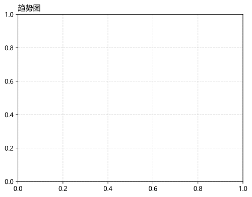
plt.title():设置图表标题fontdict:设置字体loc:设置标题位置
plt.grid():设置网格线axis:控制轴向,有x、y、bothlinestyle:线的样式,:、--、-.、-linewidth:线的粗细alpha:透明度color:颜色
plt.title('趋势图', loc='left')
plt.grid(linestyle='--', alpha=0.5)
3.3 坐标轴相关
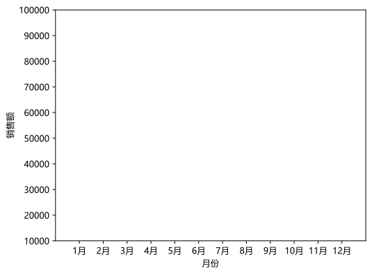
plt.xlabel():设置x轴标题plt.ylabel():设置y轴标题plt.xlim():设置x轴范围plt.ylim():设置y轴范围plt.xticks('刻度位置(数值)', '显示值'):设置x轴显示的刻度值plt.yticks('刻度位置', '显示值'):设置y轴显示的刻度值
plt.xlabel('月份')
plt.ylabel('销售额')

idx = [i for i in range(1, 13)]
mon = [str(i) + '月' for i in range(1, 13)]

plt.xticks(idx, mon)
plt.xlim(0, 13)
plt.ylim(10000, 100000)
(10000.0, 100000.0)
3.4 显示图例
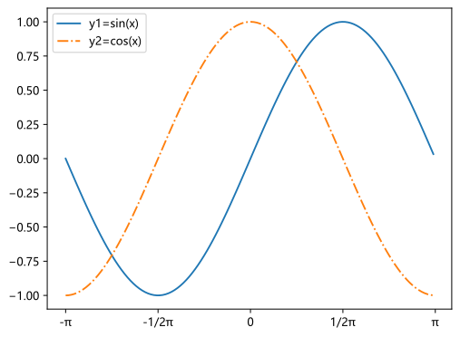
设置完label参数之后,使用plt.legend()才能显示图例。
# 生成数据
x1 = np.arange(-1*np.pi, np.pi, 0.05)
y1 = np.sin(x1)
y2 = np.cos(x1)

# 设置x轴刻度
plt.xticks([-1*np.pi, -0.5*np.pi, 0, 0.5*np.pi, np.pi],
           ['-π', '-1/2π', '0', '1/2π', 'π'])

# 作图
plt.plot(x1, y1, label='y1=sin(x)')
plt.plot(x1, y2, linestyle='-.',label='y2=cos(x)')

plt.legend(loc='best')
<matplotlib.legend.Legend at 0x1e60c67bf70>
4 一图多表
fig, axs = plt.subplots(nrows=1, ncols=1, figsize=(width, height))
- nrows:子图的行数
- ncols:子图的列数
- figsize:画布的大小
- fig:返回的画布对象,用于调整整体的属性
- axs:返回的子图数组,用于绘制各个子图,是一个Numpy数组,可以通过
axs[0, 1]访问特定子图
fig, axs = plt.subplots(2, 2, figsize=(10, 8))
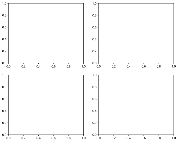
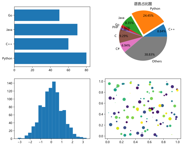
上一章的图形依次放入子图中。
axs[0][0].barh(y, width)
axs[0][1].pie(rate, labels=lan, explode=ex, autopct='%.2f%%', pctdistance=0.8)
axs[1][0].hist(data, bins=20)
axs[1][1].scatter(sx, sy, c=colors, s=sizes, cmap='viridis')
<matplotlib.collections.PathCollection at 0x1e60cec4880>
为了精确地控制子图,使用对象式写法axs.set_方法名。
axs[0][1].set_title('语言占比图')
Text(0.5, 1.0, '语言占比图')
fig

助力广东及东莞地区开发者,代码托管、在线学习与竞赛、技术交流与分享、资源共享、职业发展,成为松山湖开发者首选的工作与学习平台
更多推荐



 13
13 0
0- 0


 已为社区贡献1条内容

所有评论(0)